Why are rosés promoted differently to reds and whites? I noted this oddity early in my career and 47 years on nothing has changed.
The marketing of wine develops an imagery to assist sales so what is the reasoning behind this difference?
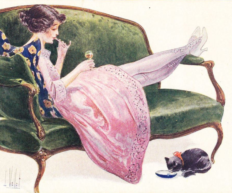
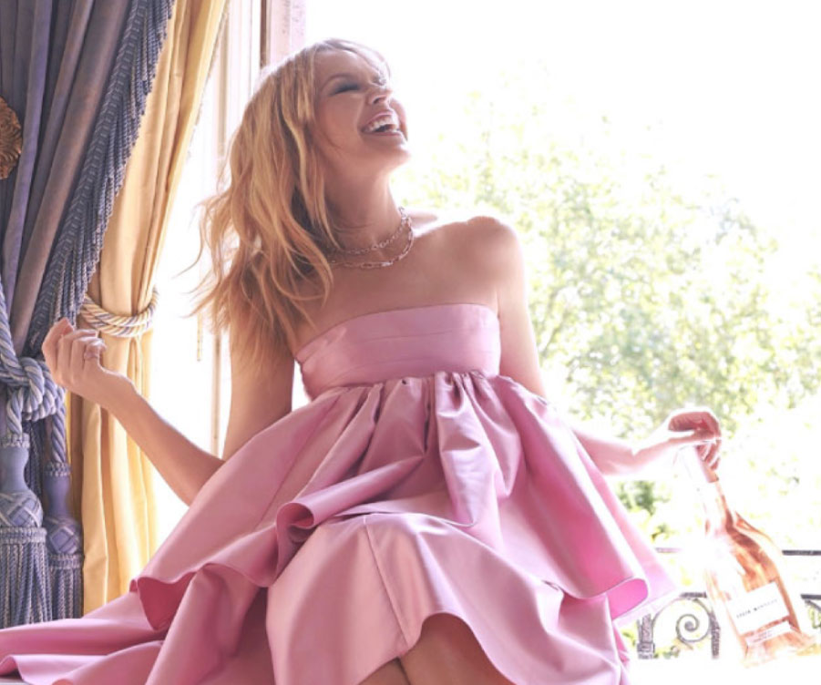
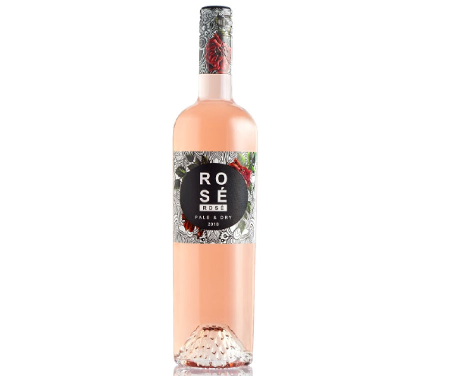
Consider the bottles, perhaps inspired by Mateus, which can be odd shapes, while the labels may be non-conventional, ornate and with pink colouring, and often the overall look suggests a wine style that is targeted at females.
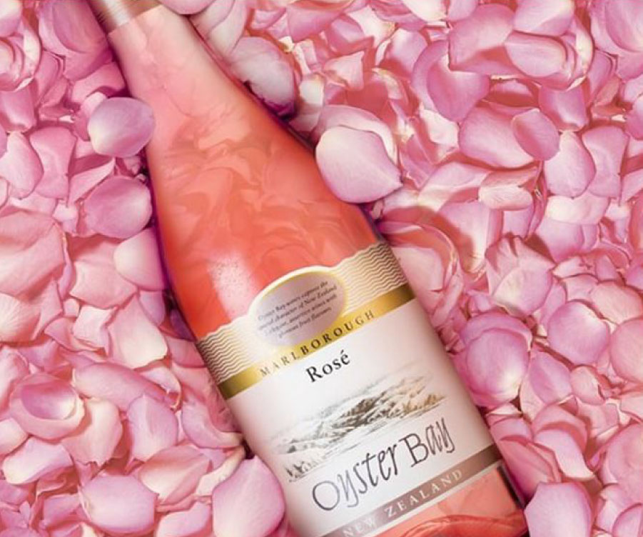
An example is the Oyster Bay Rose from around 2016 showing the bottle lying on a bed of rose petals.
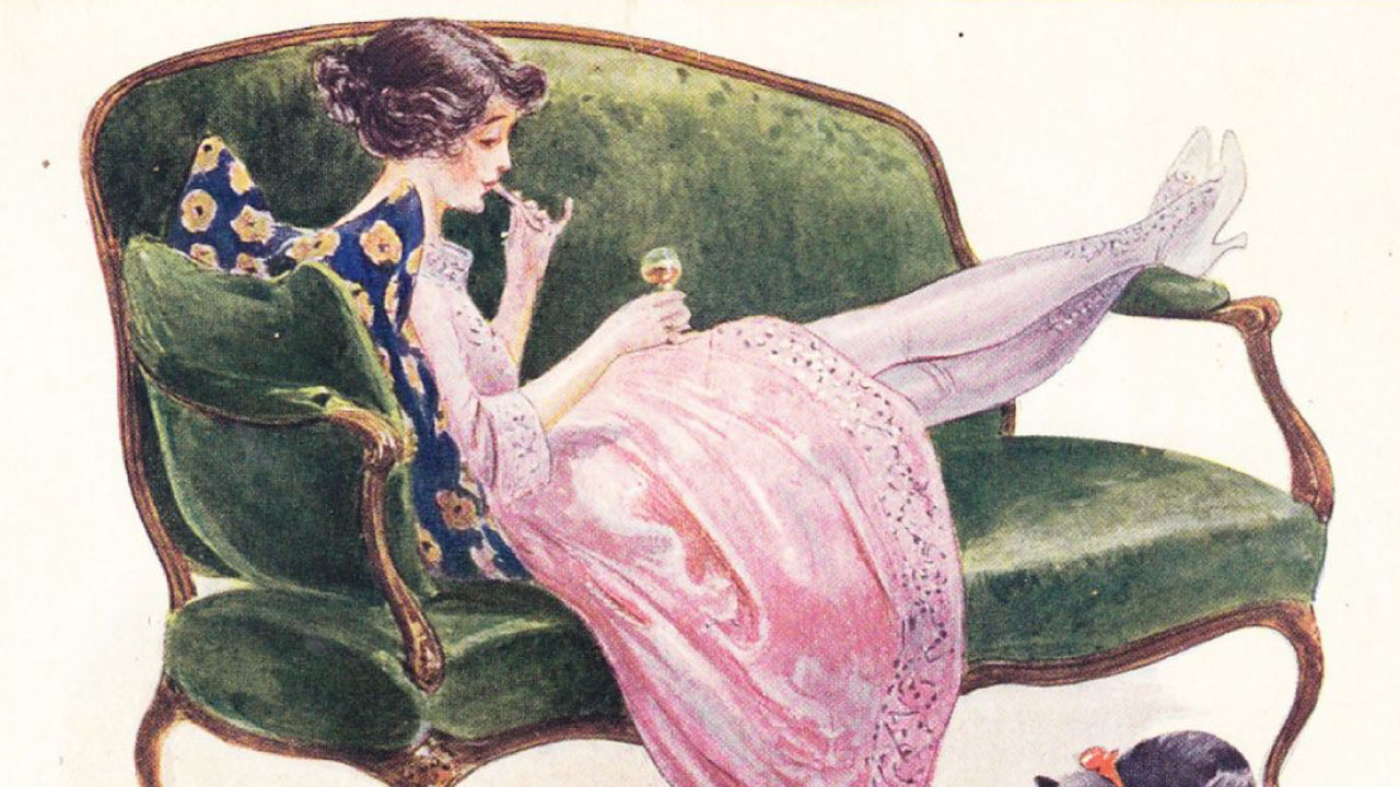
I know of no other wine type that makes an appeal to half the customers and yet so many marketing groups have concluded that this direction is the best chance for sales.
Whatever the reasons rosé lacks status.
A serious drinker is interested in the taste and with rose being sold as an oddity it is not surprising that few try the wines.
I noted in the 1970s that the taste of those pale, rose-amber tinted Kaiser Stuhl Barossa Valley Rosés made from Grenache had surprising complexity.
In the early days at Glug we explored this potential using Barossa Valley Grenache and Mataro and the results were a revelation. Two come to mind, the Harem ‘Rosita’ Barossa Valley Mourvedre Grenache Rosé 2006 and Harem Rosita Barossa Valley Grenache Cinsault 2013.
They were difficult to sell as the wrong image can overwhelm quality though we will persevere. Rosés made from warm climate fruit are far more interesting than those made from cool climate fruit and makers in warm regions should begin trials as a new product category awaits.
